A fan’s subjective perspective on the early stages of animation history and the evolution of traditional animation. In part 2 of ‘The early stages of animation,’ I will talk about some famous cartoons by Disney, Fleischer Studios and others.
Early stages of animation: 1920-1937 – The rise of cartoons
3) Disney
America had a huge English-speaking market and more money to spend, so it makes sense that the biggest animation studios were founded there: Disney, Fleischer Studios, Warner Brothers Cartoons… I’m going to elaborate mostly on Disney, because they were simply the best for reasons I both can and can’t explain. There’s an observable quality difference between early Disney shorts and anything else from the same decade, but somehow they manage to make you feel involved with the characters and grip your attention. Even though Walt Disney seldomly animated himself anymore as years went by, his creative vision, drive and controlling nature shaped the way Disney’s animation would evolve. More about that further down and very possibly in a future post. Or maybe somewhere else, from a smarter person who knows what he’s talking about.
Early efforts
In 1923, Walt Disney founded a studio and started doing his own thing. Before he did some things (Laugh-o-grams). And then in his own studio, he did well, more of the same kind of things (Alice Comedies) . Oddly, in both videos a real live girl can be seen interacting with cartoon characters. I guess this was his way to introduce animation to the audience and attempt to involve them. They then tired of the mixed format and went on to full animation.
Oswald the Lucky Rabbit – Trolley Troubles, 1927
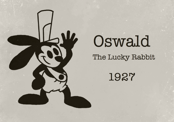 Disney introduced Oswald the Lucky Rabbit, as an answer to Felix the Cat and Fleischer’s Koko the Clown, and it looked amazing. For some reason, maybe because of this cartoon, animators became obsessed with trains and trolleys and cows on tracks. Oh, and here is one from when Disney lost the rights to Oswald and the character went to another studio. Spot the differences.
Mickey Mouse and Silly Symphonies
Mickey Mouse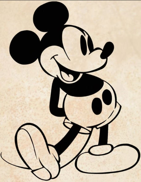 entered the stage to replace Oswald and at the suggestions of composer Carl Stalling, Disney developed the Silly Symphonies cartoons. The bulk of these animated shorts featured slapstick gags and anthropomorphic animals, plants and objects using each other and their surroundings as musical instruments. Music was an important part of the cartoon and every one of them featured a synchronized soundtrack.
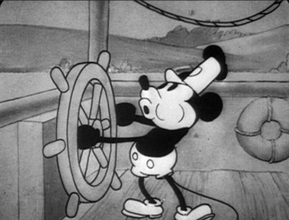
Steamboat Willie, 1928
You may have seen this one before or recognize it from a Simpsons homage. It was Disney’s breakthrough and the debut of Mickey Mouse. After seeing The Jazz Singer, the first movie with synchronized music and some singing and talking, Walt Disney decided this was the way to go for animation. There have been cartoons with sound before, and with synchronized sound, but not a fully synchronized soundtrack. Not only is Steamboat Willie innovative in this respect, they stepped things up a notch in terms of animation quality too.
Other notables and personal favorites:
Apologies for the crappy screen shots, pausing videos at the right time is hard.
Mickey Mouse – Plane Crazy, 1928
Drawn by Ub Iwerks. First animation to use a camera move (5:15). In reality the animators piled books under the spinning background to bring it closer to the camera. In general there’s more detail in the backgrounds and movements are smoother. And there are airplanes. In case you like airplanes.
Mickey Mouse – The opry House, 1929
A bit more sophisticated and realistic. Mickey takes on different roles within the story of the vaudeville show he’s performing. “…Our characters were beginning to act & behave like real persons. Because of this we could begin to put real feeling and charm into our characterization. After all you can’t expect charm from animated sticks and that is what Mickey Mouse was in his first pictures” – Walt Disney. Quotes makes your text look more professional.
Mickey Mouse – The Karnival Kid, 1929
Famous first words: “Hot Dogs!” – Mickey Mouse. I like the different rides moving at the same time. I’m pretty easy to impress at this point.
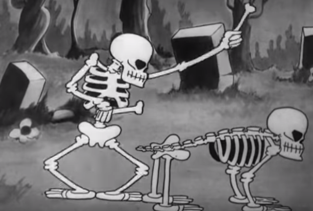
Silly Symphonies – The Skeleton Dance, 1929
The first one in this series. A bit ‘darker’. Dancing skeletons and scary background trees. Later revisited by Ub Iwerks in Skeleton Frolics.
Mickey Mouse- The Haunted House, 1929
Another short of skeletons having an orgy.
Bet you clicked right on that link.
Silly Symphonies – Frolicking Fish, 1930
Didn’t really catch my eye at first, but this guy explains what’s significant about it. Disney suggested improving animation by varying the spacing in between the drawings. Slow, smooth movements instead of relying on held poses. I know you guys like the technical stuff, but I’ll keep it short for readability.
Silly Symphonies – The Busy Beavers, 1930
Included this for the incoming wave crashing through the trees at 5:05. I like how the forces of nature play a role, like an unstoppable enemy character.
Silly Symphonies – The Cat’s Out, 1930
Poor cat! I just really feel for him, that’s really all about this one. This is animated by Wilfred Jackson. I can’t put my finger on it, but there’s something about his style that sucks me into the story. Apparently he directed some Silly Symphonies that won Academy Awards and directed sequences in major Disney features such as Snow White, Fantasia and Lady and the Tramp.
![]() Silly Symphonies – Egyptian Melodies, 1930
Silly Symphonies – Egyptian Melodies, 1930
Dull dance routine, no story, but interesting intro. The spiders beckons the viewer in, breaking the fourth wall. A long shot of the spider crawling through the hallways with impressive 3D effects. Another sequence that stands out is when the drawings on the wall come to life. Instead of leaping from the wall, they were kept two dimensional and flat. Then we see two overlapping images fading in and out, of the spider going crazy and the two-dimensional characters spinning round and round on scrolls. Fun short, lots of technical experimentation going on. Wouldn’t call this a hidden gem, but odds are you haven’t seen it yet, so let’s put a ribbon on it. It’s the necklace from Laputa. I’m so cheesy.
Silly Symphonies – Fishin’ Around, 1931
Animators seemed to be putting in more and more effort. Note the reflections on the water in the opening shot.
Silly Symphonies – The Clock Store, 1931
Another great example of why I can’t tell you why I like Wilfred Jackson’s stuff. I just do. Let me know if you can explain it in my stead. The figurines at 3:30 look very detailed and do an impressively animated dance. Smooth, realistic movements, almost human. A more elaborate version of this can be found in The China Shop, 1934. I feel like they could’ve been more creative with the clocks, though.
Stories
Mickey Mouse – Mickey’s orphans, 1931
Was nominated for an Academy Award, but lost to Flowers and Trees. Actually not that significant animation-wise, but does mark a significant evolution in Disney cartoons: more dialogues and acting from the characters. Less dancing or musical sharades.
Silly Symphonies – The Ugly Duckling, 1931
The following Silly Symphony was The Ugly Duckling, which follows one story from beginning to end. It looks like Disney’s set off in the right direction. But the real shift will take a while.
Mickey Mouse – Barnyard Olympics, 1932
Just really really fun.
Silly Symphonies – Flowers and Trees, 1932
The first animation in full-color. I won’t bore you with the details about two-strip Cinecolor and three-strip Technicolor. But somehow, after seeing all this black-and-white stuff, it’s almost a relief to see some color. Instead of picking the more famous Mickey Mouse series to get the first cartoon with color, Walt Disney chose the less popular Silly Symphonies to boost sales. Although it was a business decision, they did make effort to use the benefit of color, for example using light, green, brown colors for the lively, healthy characters, and darker, grey tones for the evil character. There’s plants, rain and fire, which gives the audience a varied color palette. Although it was originally intended to be black and white. Disney then had 4 year exclusivity on three-color Technicolor, because of budget restraints at the other studios. And now I’m tired of the word ‘color’.

Mickey Mouse – The Wayward Canary, 1932
Loads of birds to animate at the same time. Must’ve been hard. I assume. What do I know.
Mickey’s Nightmare, 1932
I like this one. The dream sequence represents the character’s hopes and fears.
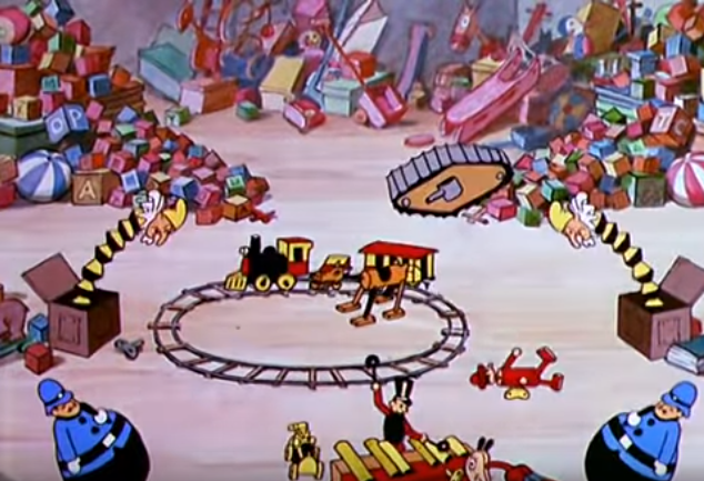 Silly Symphony – Santa’s Workshop, 1932
The background artists upped their game. Impressive amount of detail in every shot.
Mickey Mouse- Mickey’s Good Deed, 1932
One of the best stories so far. A story of good deeds, greed and charity, shown during the low point of the Great Depression. Mickey is at his best, and the audience experiences a whole range of emotions. I cried and so did you. Just kidding, I didn’t cry.
Mickey Mouse – Building a Building, 1933
Sky Scrappers rip off but cool and strong animation.
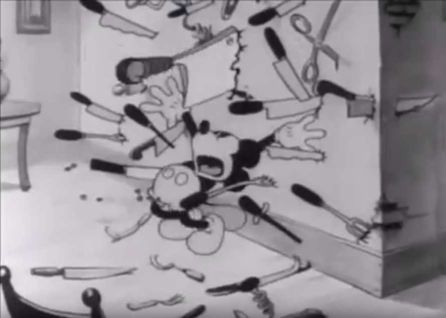
Mickey Mouse – The Mad doctor, 1933
Aww, he really wants to save his dog. Some cool effects here, toying around with perspective, similar to Egyptian Melodies. There’s some skeletons too, in case you were looking for more skeletons.
Silly Symphonies – Three Little Pigs, 1933
Apparently the most successful animated short ever made. According to insiders, due to the three leads and their characterization through posture and movement. Quoting animator Chuck Jones: “That was the first time that anybody ever brought characters to life [in an animated cartoon]. They were three characters who looked alike and acted differently”. Disney realized the importance of well-developed stories and characters. Around this time, the adding of storyboard artists was an important innovation in animation. The success of Three Little Pigs apparently prompted Disney to take more risks, such as using the multiplane camera and most notably: creating a feature-length animated movie. Good paragraph, Joe.
 Mickey Mouse – Giantland, 1933
Neat, he’s inside his mouth. Cool.
Silly Symphony – The Night Before Christmas, 1933
I just like stuff like this.
Silly Symphony – The China Shop, 1933
Another one by Wilfred Jackson. Easily overlooked. Most of it is nothing new, just toys coming to life and dancing around. But the way the shopkeeper looks at the store before he closes the door could be considered a big step forward in terms of characterization. A bit later in the short we get a figurine dance like in The Clock Store but more elaborate. Very nice work on creating slow, realistic human movements. The animation on the sater and the china breaking looks good too.
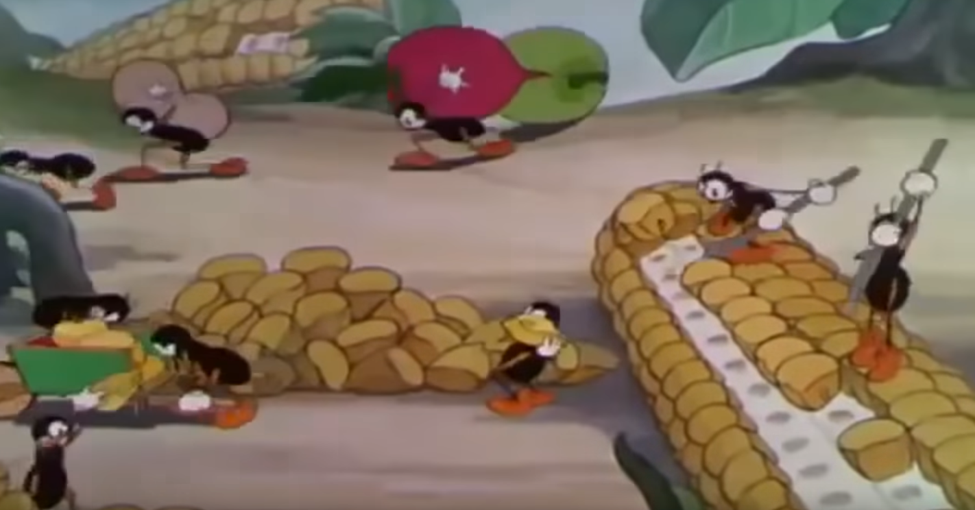
The Grasshopper and the Ants, 1934
Wee, look at all them bugs! I am much too easily impressed by multiple characters moving in different ways at the same time. This is one of the best so far. Wilfred Jackson again, of course.
Mickey Mouse – Camping Out, 1934
Fun and well made.
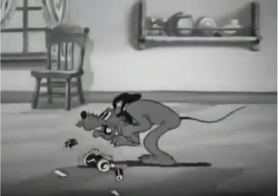
Mickey Mouse – Playful Pluto, 1934
A famous one where Pluto gets a piece of fly paper stuck to him. As the name suggests, Pluto shines and characterization is a big part of the cartoon. Pluto really has a mind of his own, more than in any of the shorts he featured in before. It’s a simple story, but a character you can sympathize with in a certain circumstance is all it takes to create humor. From here on, Pluto tends to steal the show in every cartoon he’s in. Oddly, even though Mickey’s a mouse, Donald’s a duck and Goofy is a uh, an animal I guess (?), they can all speak but Pluto remains a dog. He has the characteristics and behaviors of a dog and he can’t speak. So animators really have to make an effort to show what he’s feeling. Most of the time he’s trying to figure out what’s going on, which makes him even more endearing.
Funny Little Bunnies, 1934
There’s something very satisfying about watching these bunnies make Easter eggs and other delicious-looking things. Just seeing everything falling neatly into place is so soothing to my neurotic nature. Much in the same way a robot transforming scene can be appealing. Am I the only one who seems to remember seeing these bunnies go at it a million times as a kid?

Silly Symphony – The Wise Little Hen, 1934
First appearance of Donald Duck, looking like, well, a decent but obviously older version of Donald Duck.

Mickey Mouse – Mickey Plays Papa, 1934
The animation on the creepy stranger is amazingly realistic. In general the drawings on the characters are a bit more evolved as well.
Silly Symphonies – The Goddess of Spring, 1934
Operatic and over-dramatic. But it looks like an important step towards the animation on Snow White. Animators had loads of experience with animals but barely with humans. Her arms are a bit rubbery, but they’re trying at least.
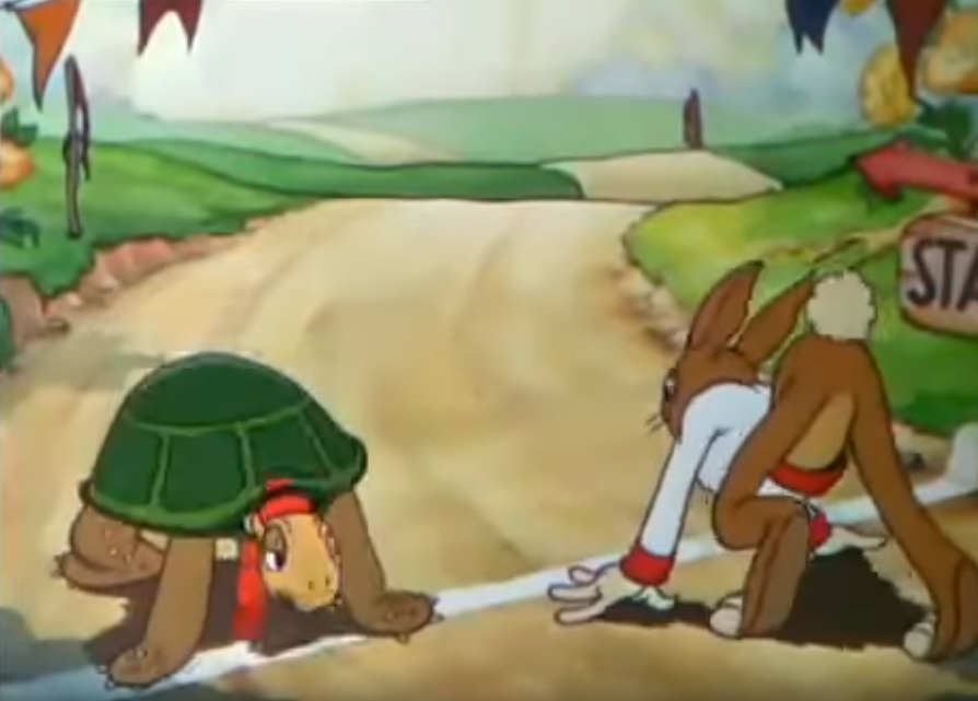
Silly Symphonies – The Tortoise and the Hare, 1935
I’m reliving my childhood.
![]() Mickey Mouse – The Band Concert, 1935
Mickey Mouse – The Band Concert, 1935
In the first Mickey in color, revolving around music again, as in the good ol’ days of like, a few years ago, you can see how far Disney’s animation has evolved in just a few years. When you’re watching anything from another studio around this time, compared to this or other Disney shorts, it’s clear that the competition wasn’t able to keep up with Disney in terms of animation quality. 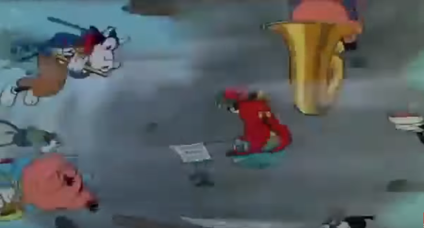 Of course the fact that Disney had the exclusive rights to three-strip Technicolor for a few years gave them an easy advantage. One thing that I’m noticing now is how big a portion of the screen the characters take up compared to early cartoons. Also the symbiosis between music and the action on the screen is unseen and must have been a huge influence on later cartoons. The tornado sequence is jaw dropping. They were really showing off with this one. The Band concert is considered one of the best cartoons ever made and rightly so. I agree. Awesome short. Great job. Wilfred Jackson, you’re the man. Disney sets the bar very high with this one, although their own following shorts seem to able to be consistent in quality. Again, not exactly a hidden gem, because it gets general praise, but hell, it’s too good.
Mickey Mouse – Mickey’s garden, 1935
Another childhood memory. The beetle gave me nightmares. For some reason I like when they animate dream sequences, drug trips and other kind of warped realities.
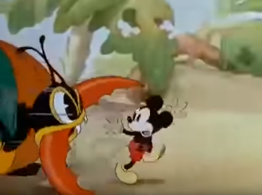
Mickey’s Fire Brigade, 1935
Fun with fire.
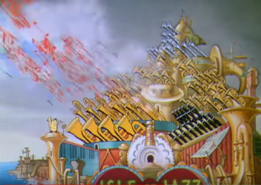 Silly Symphony – Music Land, 1935
Everyone and everything’s an instrument! I feel an urge to use this overly satisfied smiley: ^^ Love the bigger shots, where you see the whole island in motion. It reminds me of Miyazaki’s scenes with big intricately moving things like in Howl’s Moving Castle or Spirited Away.
Silly Symphony – Three Orphan Kittens, 1935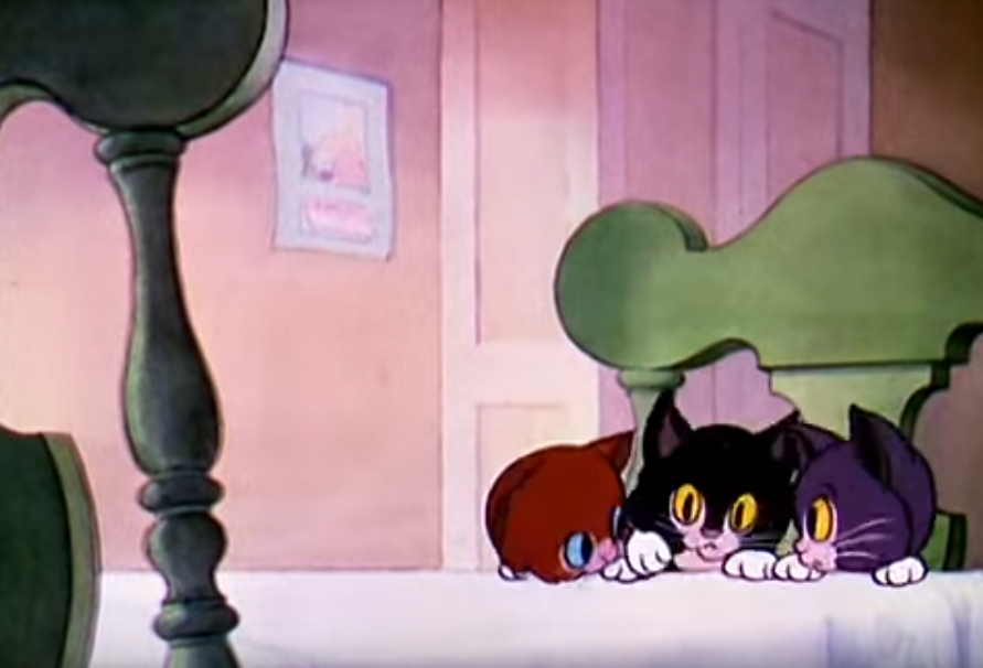
Disney animators raise the bar on cuteness. Look at those little paws. Check out the long tracking shot from 5:13 where the room seems to move around the kitten.
Silly Symphonies – Broken Toys, 1935
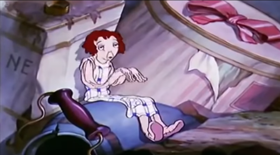 Somehow this one resonated with me. Especially the design worn out rag doll. I wonder what that says about me. Oh well. Small warning: Broken Toys might be offensive to some. Unless you, like me, have been thoroughly desensitized by anime to racial and gender stereotyping. In that case, enjoy.
![]() Mickey Mouse – Thru the Mirror, 1936
Mickey Mouse – Thru the Mirror, 1936
Looking at this, one gets the feeling that there’s no limit to what Disney animators can do. Essentially there’s nothing new to be seen. Mickey has a trippy Alice in Wonderland dream and dances around with anthropomorphic objects. But around 1935-1936, Disney is reinventing the tropes and breathing new life into old ideas. There have been some weaker ones, but this one stands out again. Maybe it’s the color, or the fact that there’s a high definition version on YouTube, but even though you saw it all before, it looks different and seems completely new. Every object, every character, every gag feels like a novelty. You don’t know what the hell I’m talking about, let’s rank this under “can’t explain why it’s good” and wonder why I bother attempting to blog. And give it Hidden Gem rating.
Silly Symphony – The Country Cousin, 1936
Great story, good characterization and great animation at the end. Poor hillbilly mouse.
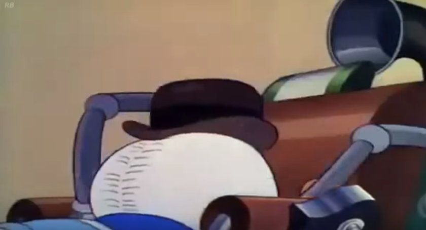 Donald Duck – Modern Inventions, 1937
“Your hat, sir.”
In case you’re wondering, it’s a picture of Donald’s butt wearing a hat.
Mickey, Donald & Goofy – Clock Cleaners, 1937
1936-1937 is the best era for these three musketeers. Here’s a good example. Love the ending where Goofy just keeps on walking goofily and Mickey has to save his ass.
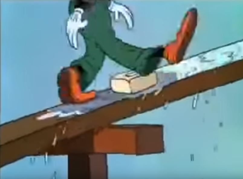
Silly Symphonies – The old Mill, 1937
A feast for the eye. Highly detailed backgrounds, wonderful colors. Even when I saw it on tv in the 90’s it was engaging and dramatic. It still holds up today. In these later Silly Symphonies, Disney tested advanced animation techniques like the multiplane camera, complex lighting, color effects, three-dimensional rotation of detailed objects. The Old Mill is notable for the use of the multiplane camera. Usually this is used to slide pieces of the background over each other. Here you see it used as a way to look around the inside of the mill. There’s also a noticeable improvement in the depictions of animal behavior, water, wind, etc. Ten years ago, these animals would be dancing around and playing instruments. Now they’re realistically behaving like animals, albeit slightly charicaturized. All these little things signalize a distinct new direction for Disney, and we’ll see the result of their experimentation when we get to their feature films. Hayao Miyazaki called The Old Mill his favorite Disney film. Academy Award winner.
I have to give some credits to Ryan Kilpatrick and other commenters at The Disney Film Project intanibase for helping me understand all these cartoons.
4) Fleischer
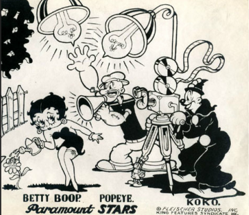 In 1929, Dave and Max Fleischer formed Fleischer Studios Inc. Here animators seemed to have more creative freedom than at Disney’s or at least allowed to make more mature and darker content. The best examples, and the most famous characters, are Betty Boop, with her constant underwear flashing, and Popeye, manhandling his way through life. Building on years of pioneer work in the animation field, Fleischer’s early shorts had a quality that was inconsistent but at rare occasions rivaling that of the Disney cartoons, or even surpassing it. Most of the times though, they featured rubbery characters, bouncing up and down. They were consistent in being weird, in good and bad ways. Here’s the good stuff:
![]() Talkartoons – Swing you Sinners, 1930
Talkartoons – Swing you Sinners, 1930
By Willard Bowsky and Ted Sears, who was hired away by Disney in 1931. One of Jon Kricfalusi’s favorite cartoons, surpassing The Skeleton Dance, also set on a cemetery. Absurd and kind of dark. Escalates like crazy. One you have to watch a few times to get a hold on everything that’s going on. Filled to the brim with weird gags and quirky ideas, these relentless and overwhelming sequences remind me of Rick and Morty’s absurdest moments. This is the first one of this era that gets a proper hidden gem rating. Seeing this kind of thing makes you think Disney never took full advantage of the possibilities of animation. The old Fleischer shorts were a lot less influential than their Disneian counterparts, so sadly, in the decades to come, it was rare to see so much experimentation in animation. Some other fun shorts from these guys are Sky Scrapin, 1930, The Male Man, 1931. I always hear a little giggle in my head when I use the word shorts.
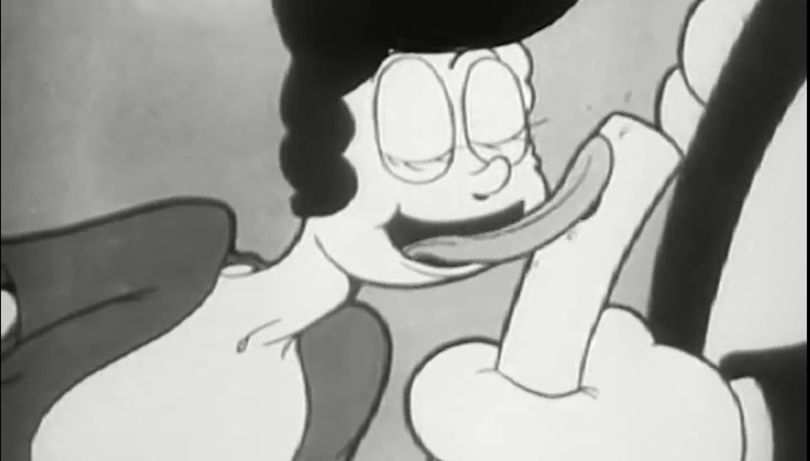 In My Merry Oldsmobile (commercial for GM) , 1931
When sexual harassment was sweet and dandy.
Talkartoons – Bimbo’s Initiation, 1931
Even darker than Swing You Sinners. Features an early prototype of Betty Boop. Man, Fleischer Studios’ characters had it rough back then.

Betty Boop 1932-1939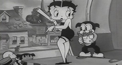
A major character for Fleischer Studios. The sexualization and infantilization of women in the (animated) flesh. The first sex symbol of the animated screen. Was heavily toned down in the mid-30’s as a result of the Production Code.
Betty Boop M.D., 1932
Surreal one.
Betty Boop’s Ups and Downs, 1932
Planet earth goes up for sale. Context: foreclosures and property auctions during the Great Depression. Saturn wins the bid and removes the earth’s magnet, making gravity disappear. Cool stuff.

Betty Boop for President, 1932
Mr. Nobody runs for president. The Betty Boop series was getting very consistent in animation quality and weirdness. Looking at this one, something looks familiar here.
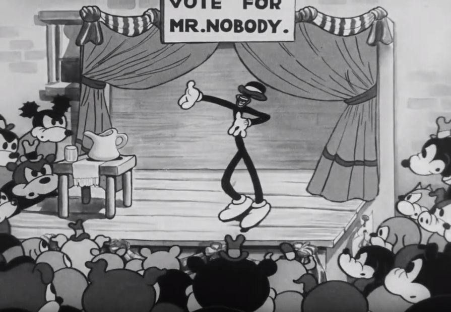
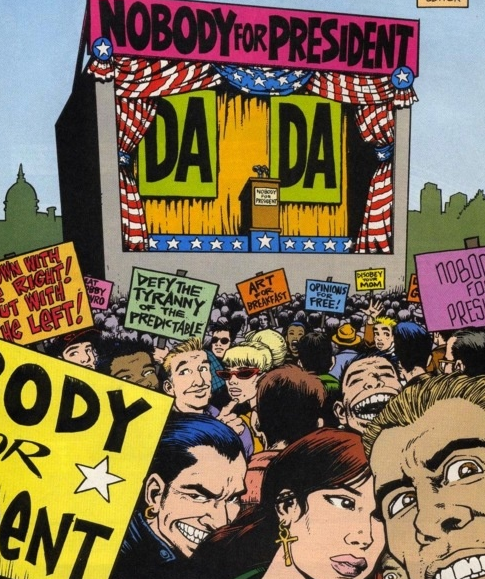

Hm.
Betty Boop – Snow White, 1933
One of the most imaginative ones of Fleischer Studios in this era. A rare instance where rotoscoping was, in my opinion, done right. Roland Crandall, who got to make this one by himself, used live footage of Cab Calloway’s dances, rotoscoped them and added some wizardry and transformations during the dance.
Popeye the Sailor Man 1933-1942
Popeye the Sailor Man, 1933
First appearance of, you know, this guy.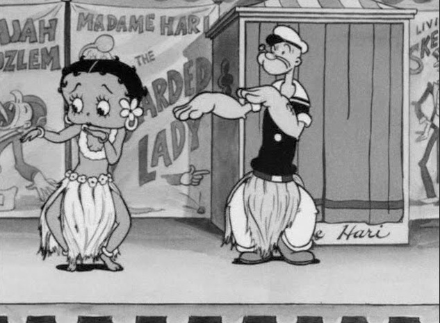 The Popeye cartoons are really fun, but like the Betty Boop series, the animation is very dependent on the rhythm of the music. The characters have these repetitive movements that seem a bit unrealistic. The Disney shorts of this time were better made, but Popeye is always fun in its own right. For modern day viewers, Popeye can seem very violent. He fights to solve everyday problems and Olive gets thrown around like a ragdoll, which can be quite disturbing.
Popeye The Sailor – Sock a bye baby, 1933
A very aggressive cartoon of Popeye punching everyone and everything to get them to be quiet so his baby can sleep. See kids, this is how a man solves a problem.
Betty Boop – Ha Ha Ha , 1934
Betty Boop and Koko the Clown inhale laughing gas. The animators mix live action with traditional animation in an interesting way. Bunch of junkies.
In June 1934, The Motion Picture Production Code, which had existed for several years, was more severely enforced. Betty Boop got a bit dull after this and became somewhat of a housewife character. Disappointing.
Betty Boop – Poor cinderella, 1934
First Betty Boop in color. Disney had full rights to 3-strip Technicolor, so this was made in 2-strip. Actually looks kind of cool like this. The backgrounds are amazingly detailed. In order to give some scenes additional depth of field, the short used Fleischer Studio’s Rotograph process, not to be confused with Max Fleischer’s other invention, the Rotoscope. The Rotograph is used to film backgrounds as live action and add the animated characters on top of it, so it looks like the animated character are walking around in the real world. It’s done really well here, because they add effect to the real background to create a wonderful scenery. In some other instances, it gives a cool depth of field illusion at best, but it doesn’t really add to the story and just makes the characters seem out of place.
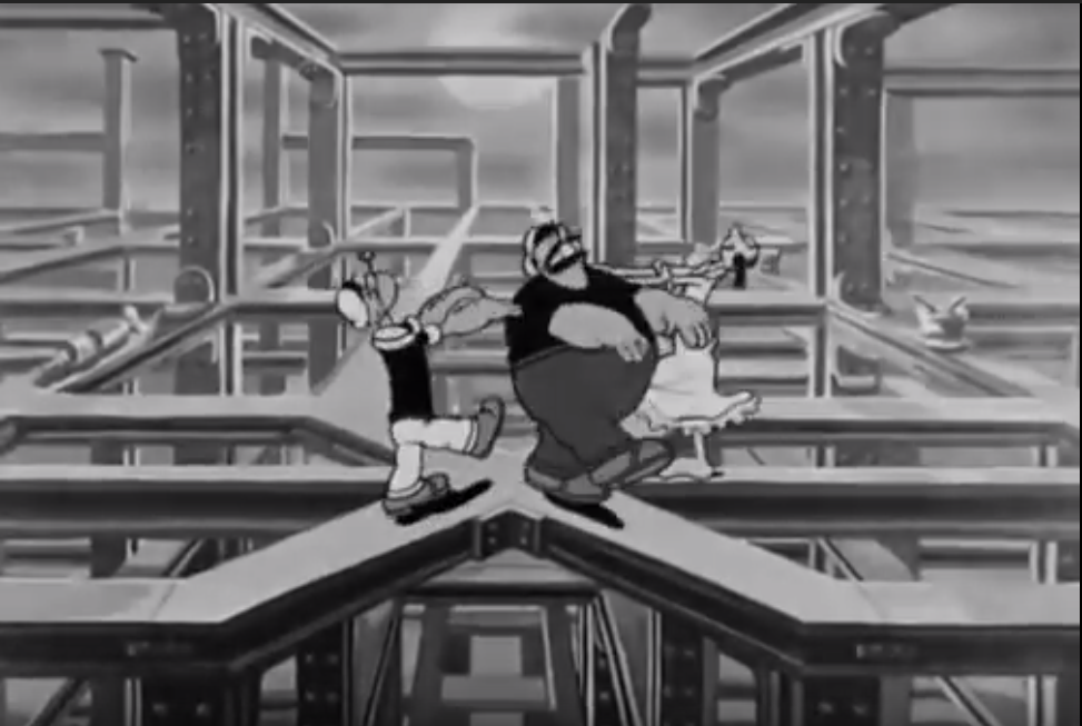 Popeye The Sailor – A Dream Walking, 1934
Cool visuals.
Popeye the Sailor – The two alarm fire, 1934 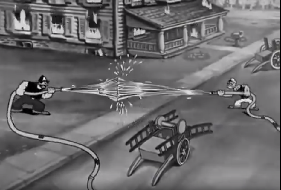
Just including this because for this shot. The ancestor of the double kamehameha showdown.
Popeye the Sailor – King of the Mardi Gras, 1935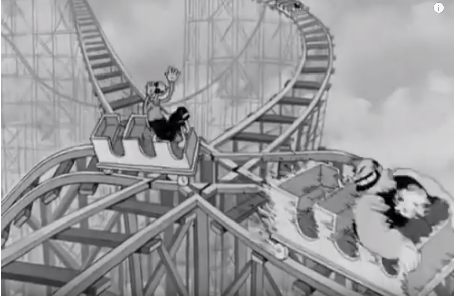
Spectacular stuff.
Color Classics 1934-1941
In 1934 they started producing the Color Classics series. The name says it all. In general, the Color Classics were more interesting in terms of animation than the Betty Boop and Popeye cartoons of the same time. By the mid-30’s, Fleischer’s cartoons had reached a consistent level of decent animation, but were not able to follow the relentless speed of Disney’s evolution. Fleischer was limited, I’m guessing in both budget and expertise. To reduce the amount of difficult animation, characters rarely interact with their surroundings and moved in a steady rhythm. Most shots were static and when characters moved around, they usuallt moved from side to side. Also, the multiplane camera and the rotograph were used to create the illusion of depth. There he goes, cheating again (see first post about rotoscoping). Actually, Max Fleischer predicted 3D was the future of cinema, with which he of course meant his invention of the stereo optical process. “There will come a day when audiences can go to a theater and see only a cartoon feature, for the possibilities of the medium are limited only by the imagination of our artists.” I could not agree with you more, Max. So keep animating for real, Fleischer bros!
Color Classics- The Song of the Birds, 1935
Sad.
![]() Color Classics – Musical Memories, 1935
Color Classics – Musical Memories, 1935
Beautiful. I couldn’t figure out what was going with the backgrounds, when I first saw this. Some of them look real, some of it looks like those small sets they make for stop motion animated movies. Then I figured out Fleischer Studios regularly made use of the Rotograph or the stereo optical process. Anyway, whether the backgrounds are drawn or not, there is always a kind of discrepancy between characters and backgrounds, like they’re figures from one world placed into another world. I’m not sure wether this is intentional or just an unavoidable consequence of the techniques they used, but it works really well in this short about memories. In all of the Fleischer cartoons I’m noticing a stylish use of either the multiplane camera or the stereo optical process in sequences where characters move horizontally. Hidden Gem.
Color Classics – Somewhere in Dreamland, 1936
More surreal backgrounds and multi-planing. I know y’all are suckers for the pretty pictures.
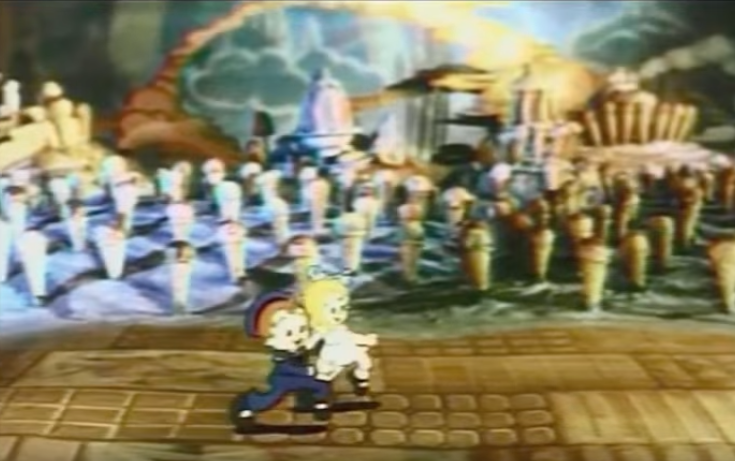
Color Classics – Hawaiian Birds, 1936
It’s almost silly how differently these guys are trying to evolve from Disney. In the intro instead of just flying from side to side, the birds fly up and down too, so the multiplane camera has to make two different motions. A bit of a silly experiment, but it looks nice.
Two-reel Popeye color specials
Popeye meets Sinbad the Sailor, 1936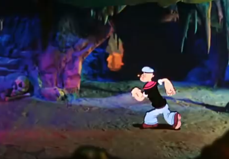
A big step for Popeye and Fleischer Studios. 16 minute specials, in full color, with a 3D background. Many of the scenes make use of Fleischer’s Tabletop process, which used modeled sets to create 3D backgrounds for the cartoon. The first is Popeye the sailor meets Sinbad the sailor.
Popeye – The Paneless Window washer, 1937
A fun cartoon to close the chapter.
5) Warner Bros’ Merrie Melodies & Looney Tunes 1930-…
Notice the pattern in the names of the series? MGM also had some Happy Harmonies going around. And there were Color Rhapsodies too. Warner Bros, of course, couldn’t be one upped by the competition and started their own experiments in color. Hugh Harman and Rudolph Ising developed the Merrie Melodies and Looney Tunes in 1930-1931. Warner Bros released them. When these two left for MGM, Warner Bros. Cartoons was founded with former Harman/Ising animator and musical composer Isadore Freleng in control. The series ran to 1969 and featured characters like Bugs Bunny, Daffy Duck, Porky Pig and Elmer Fudd. The earlier ones aren’t that good. Merrie Melodies and Looney Tunes from around this time are hard to find on YouTube and to be honest, aren’t really worth your time. 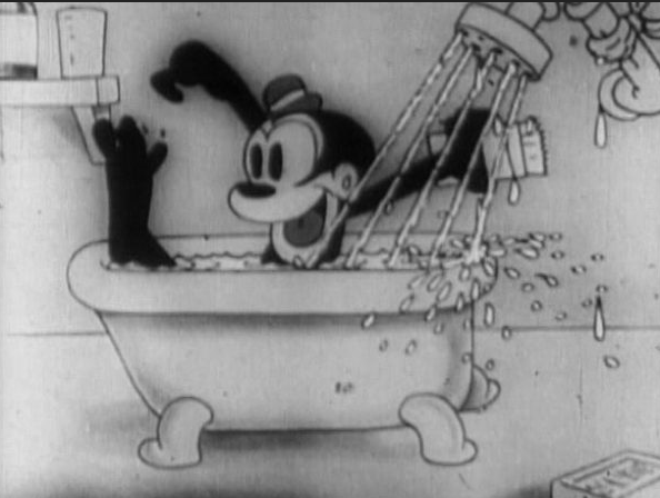 It’s only when the famous characters we all know are introduced that these series find their place next to Disney’s in the land of animation. More about that era in a next post. In this era we have Bosko, a second rate celebrity at best. Let’s check out some early ones, just for the sake of it.
I’ll have to pause right away because this is rare. I found some things that look like the direct inspiration for early platform games (Yodeling Yokels) and racing games (One More Time)
Looney Tunes – Bosko the Doughboy, 1931
A lot better quality than anything they made before. The story is challenging for a character that is usually cheerful: Bosko finds himself at war.
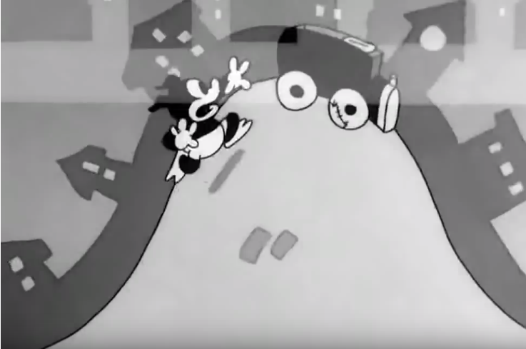 Looney Tunes – You don’t know what you’re doin’, 1931
Gets weird at the end. I like weird. I’m sensing a bit of inspiration from Swing, You Sinners.
Looney Tunes – Bosko and Bruno, 1932
For POV lovers.
Let’s skip forward in time, to when Disney’s exclusive contract with Technicolor ended and their competitors could finally catch up. Animation quality is better, but at this point in time, Disney had had a more rapid evolution.
Merrie Melodies – Page Miss Glory, 1936
Looks like this could be a cool one. Check out that art. Shame I can’t find it. What I can find are the ones responsible for this short: direction by Tex Avery, Moderne Art by Leadora Congdon and, among others, Bob Clampett. Can someone tell me wether this is the correct video? Because it looks almost too good.
Merrie Melodies – I love to Singa, 1936
Under Tex Avery the Merrie Melodies and Looney Tunes were getting better. Not quite there yet.
Looney Tunes – Porky’s Badtime Story, 1937
First direction by Bob Clampett. You can see his touch in the beginning, making a few objects behave like they shouldn’t, turning stuff inside out. It’s nice to see younger animators experimenting and heading into a certain direction, despite Disney being miles ahead.
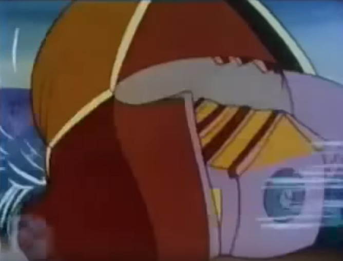
Looney Tunes – Porky’s Raiload, 1937
One of the better LT’s in terms of animation. By Frank Tashlin.
6) Other
Metro-Goldwyn-Mayer
Ub Iwerks’ ComiColor Cartoons 1933-1936
In 1933, Ub Iwerks, who had left the reign of his longtime friend Walt Disney because of his harsh command, started producing the ComiColor Cartoons. As the name suggests they were in color, but couldn’t rival Disney’s Silly Symphonies, neither in the use of color or in animation quality. There’s some eye catching background work though.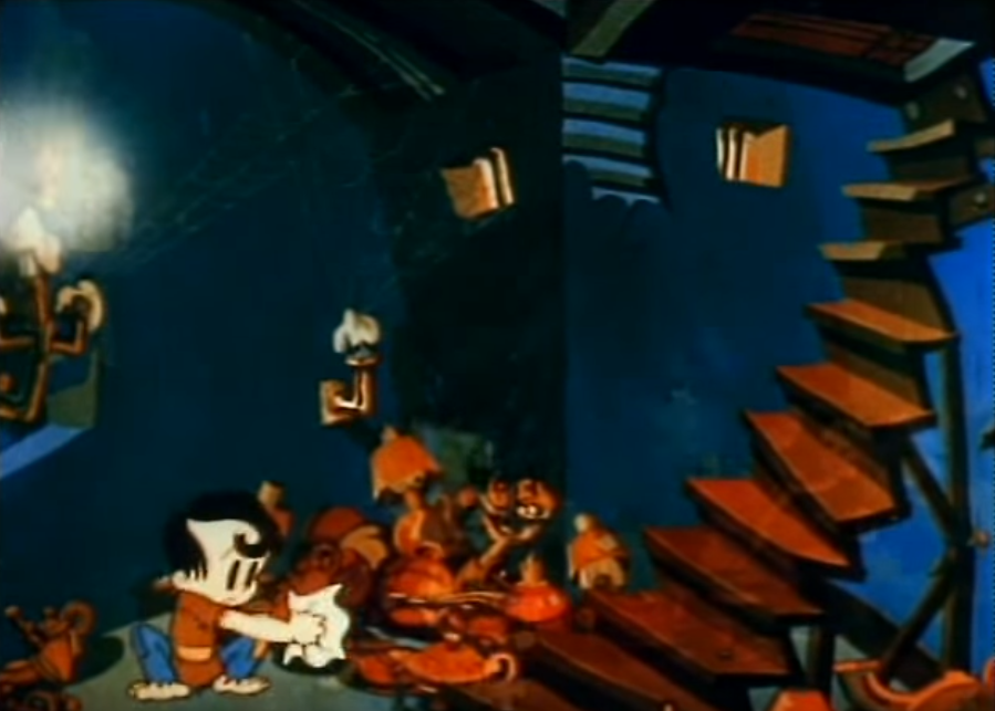
ComiColor – Aladdin and the Wonderful Lamp, 1934
The best one by far. Love the style of drawings in this.
Harman-Ising – Happy Harmonies 1934-1938
Hugh Harman and Rudolf Ising produced a series of cartoons for MGM, similar to Disney’s Silly Symphonies.
Happy Harmonies – The Calico Dragon, 1935
Everything is fabric. Looks cool. Sorry ‘bout the bad quality video.
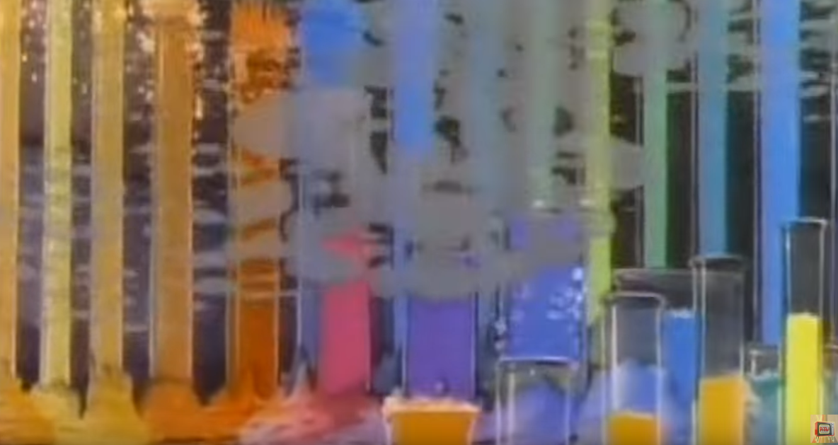 Happy Harmonies – To Spring, 1936
A rare standout in the Happy Harmonies. Directed by later cartoon giant William Hanna. Lots of vibrant colors when spring arrives at the end.
Mintz’ Color Rhapsodies 1934-1949
Charles Mintz snatched away Oswald the Lucky Rabbit from Disney. But more interesting are the Color Rhapsodies. Produced by Charles Mintz for Columbia Pictures, as a response to the success of Disney’s Silly Symphonies. In two-tone Technicolor until 1935, and visually impressive.
Color Rhapsody – Holiday Land, 1934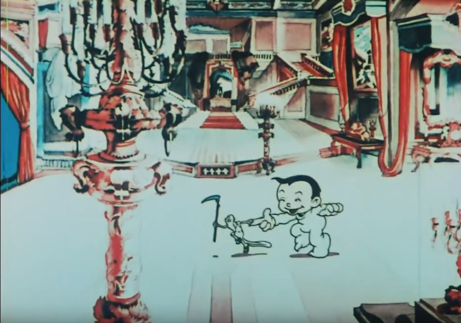
Nice to see a different style. Some really detailed shots.
Color Rhapsody – Make Believe Revue, 1935
 Again some very imaginative shots and animation ideas. The characters look and move a bit old fashioned though.
Color Rhapsody – Bon Bon Parade, 1935
Looked nice, but was skipping through this until I noticed the end. Disney’s exclusive contract with Technicolor ended and Mintz celebrates it in this short with flashy fireworks.

Color Rhapsody – Gifts from the air, 1936
Just like it. I might have a weird thing for toys.
Color Rhapsody – Merry Mannequins, 1937
Stylish backgrounds.
Color Rhapsody – The Little Match girl, 1937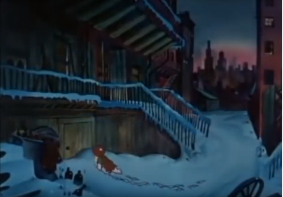
One of their more ambitious efforts. Experimental and elaborate. Lots of characters and really good colors. Utterly depressing story. The dream sequence in the middle is especially astounding. Then sadly the video quality drops when heaven gets blown away. Sad, but not as sad as the homeless orphan girl freezing to death.
Felix the Cat / Van Bueren’s Rainbow Parades
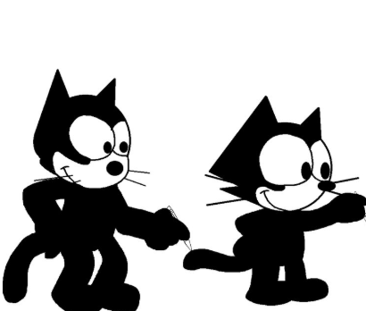 Felix Finds Out, 1924
I should include this guy. Felix the cat was introduced in 1919 and was the first merchandised cartoon character. This short is from 1924 and I don’t know why, but I like the shape of everything. Am I making sense to anyone?
Rainbow Parade
Van Bueren Studio hired Disney director Burt Gillett to produce a series of cartoons for them in color. There were some good efforts in there. Shortly, before his death in 1938, Van Bueren closed his studio.
Felix the Cat – Bold King Cole, 1936
Felix returns in a few shorts by Van Bueren Studios. Wasn’t a long lived series, but I like how the animators didn’t make it easy on themselves. Especially Felix himself has lots of movements and changing facial expressions.
Terrytoons
Not bad, but never stands out.
Terrytoons – Play Ball, 1937
Most decent one I could find.
Conclusion: In the early stages of animation history, Disney excelled as they will go on to do for decades, with consistent animation quality and heart-warming stories. Fleischer Studios produced some surprisingly weird and experimental shorts to rival them. World famous characters were introduced in this era and animation has evolved rapidly.
Quick question: why do so many people post videos on YouTube of the beginning and end credits of all these Disney and Looney Tunes cartoons?? I can’t figure this out for the life of me, why is this so interesting?
Next: The early stages of animation 1937-… – America: Disney’s feature films, Looney Tunes and Tom and Jerry
Earlier efforts and European animation: Early stages of animation (1): 1900-1940
